IT started as an innocent question, following the delivery of a church’s letter-headed article. The bearer of the article was asked: “Your church logo looks really interesting. What do the symbols represent?”
And the bearer went black for minutes. After certain guesses that did little to give any reasonable explanation, he promised to find out and get back to TribuneChurch on what the symbols on the logo represented. And that he did.
On further enquiry targeted at church goers on what the symbols of their churches’ logos represented, some had no idea what their church logo looked like, some had no idea what the symbols represented, and others attempted guesses. Only a handful managed to tell, in one response the exact meaning of the logos by which their churches were represented.
According to Kent Shaffer of Church Relevance, a mission dedicated to helping churches make better impact through provision of relevant resources, “A great church logo in and of itself does not create great church branding. But it does give a church the foundation needed to build a solid brand.”
As it turns out, no church logo is designed in isolation, as every sign on the emblem carries a significant purpose. TribuneChurch provides explanation for logos of some churches and Christian religious organisations.
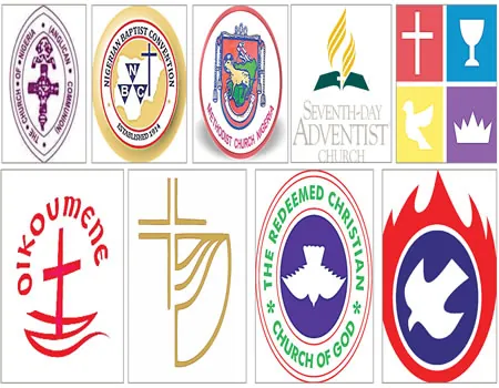
Nigerian Baptist Convention (NBC)
According to www.seiyaku.com, which features articles contributed by numerous authors from around the world, edited by Paul Harding, with validation and research conducted by Sarah Boynton, “The Nigerian Baptist Convention logo features a Latin Cross superimposed over an outline of Nigeria, West Africa. At the base of the logo is “ESTABLISHED 1914,” marking its independence from the mission started by the American Southern Baptist Convention in 1860.
“More noticeable in the logo, however, are the three triangles bearing the initials NBC.’The three triangles in the logo of the Nigerian Baptist Convention match an old Christian symbol of the Godhead, the Shield of the Holy Trinity. On the logo’s outline map of Nigeria, the three triangles happen to focus on the city of Minna, the capital of Niger State, and more noted for its mosques than churches. But whether Muslim or Christian, African, American or Japanese, nuclear propagator or victim, we can find shelter in the love of God.”
Methodist Church Nigeria (MCN)
Explaining the MCN logo, Most Reverend Michael Kehinde Stephen, of the MCN, Ibadan archdiocese, said: “Briefly the symbols on the MCN logo reflect the following: the dominant feature is the Paschal Lamb, worthy to be given power, riches, wisdom, strength, honour, glory and blessing in the map of Nigeria (though not confined within the boundaries of the map, but breaking through it at several points) for the Lord of all the universe cannot be confined by space and time, to show a church in Nigeria which is at the same time, a presence of the church universal, and bearing the Wesleyan scallop shell to signify our appropriation of and pride in our sacred heritage through Methodist Church in Great Britain, the earthly rock from which we were hewn.
“The chord was added in 1976 to signify the adoption of Episcopal form of church government. The inscription below it tells the history of Methodism in Nigeria since 1842.”
Church of Nigeria (Anglican Communion)
Dioceses of the Church of Nigeria (Anglican Communion) are at liberty to create their individual logos. However, one feature is the same: the bishop’s mitre, which represents the church’s leadership structure. The logo of the central church also features a cross and the logo is in purple, which is significant of the deep calling of the bishop. There are also depictions of tongues of fire, as well as the blood of Jesus shed for the forgiveness of the sins of mankind.
Gospel Faith Mission International (GOFAMINT)
The Gospel Faith Mission’s logo is very symbolic. According to an official of the church, the red colour symbolises the blood of Jesus; the blue colour represents love; the white colour represents Holy Spirit and the hovering dove depicts the Holy Spirit hovering over the church, not descending. It is believed that the Holy Spirit descended on the day of Pentecost.
The Redeemed Christian Church of God (RCCG)
As published by the RCCG Lagos Province 7 website, the RCCG logo features blue colour, red rings, a white dove and the colour green. The blue colour represents love; the red ring represents the blood of Jesus; white represents purity or holiness; the colour green stands for fruitfulness/reproduction/ people-oriented, while the dove is symbolic of the Holy Spirit.
“The Logo colours therefore reflect the core values of the mission: holiness; love; sanctification; fruit of the Spirit as character,” the website explained.
World Council of Churches (WCC)
As explained by the WCC, the logo depicts “the church as a boat afloat on the sea of the world with the mast in the form of a cross. These early Christian symbols of the church embody faith and unity and carry the message of the ecumenical movement.
“The word oikoumene, from which the term “ecumenical” derives, means “the whole inhabited earth.” In the original Greek, it reflected the interaction of religion, philosophy and political administration as they shaped society. When the New Testament reports an imperial decree that “all the world” should undergo a census (Luke 2:1), the reference is to oikoumene. In modern usage, the word embraces the unity of God’s whole creation and recognises every human pursuit as subject to the healing ministry of Christ’s Spirit.
“The symbol of the boat has its origins in the gospel story of the calling of the disciples by Jesus and the stilling of the storm on Lake Galilee. The ecumenical symbol was in use even before the inauguration of the WCC in 1948, and has taken many variations since then.”
Seventh-day Adventist
As the website, www.identity.adventist.org, puts it, the church’s logo has been in use since 1997, and “reflects the core values of the Seventh-day Adventist Church. Its foundation is the Bible, the Word of God, shown open because its message should be read and put into practice. Central to that biblical message is the cross, which is also a central feature of the logo. Above the cross and the open Bible is a burning flame that represents the Holy Spirit, the messenger of truth.
“The Second Coming is portrayed by the lines at the top of the design, which suggest upward momentum symbolising the resurrection and ascension to heaven at Christ’s second coming, the ultimate focus of our faith. The flame is the shape formed by three lines encircling an implied sphere. The lines represent the three angels of Revelation 14 circling the globe and our commission to take the gospel to the entire world. The overall shape forms a flame symbolic of the Holy Spirit. The cross symbol, representing the gospel of salvation, is positioned in the centre of the design to emphasise Christ’s sacrifice, which is the central theme of the Adventist faith. The open Bible, forms the base of the design and represents the biblical foundation of our beliefs. It is portrayed in a fully open position suggesting a full acceptance of God’s word.”
Foursquare Gospel Church Nigeria
The church’s logo is representative of its name. According to the church’s website, the four symbols, which represent the four-fold ministries of Jesus, are explained as follows: “the Saviour; the Baptizer with the Holy Spirit; the Healer, and the Soon-Coming King.
Church of the Brethren
For this church, according to its website, “The Church of the Brethren symbol upholds images of life in Jesus Christ. The cross recalls our baptism into Christ’s death and resurrection (Romans 6:4) and testifies to God’s plan to bring ‘all in heaven and earth . . . into a unity in Christ’ (Ephesians 1:10 NEB).
“The circle, partially defined, represents the world into which we are sent by Christ (Matthew 28:19). The circle also affirms that as members of Christ’s body we are members one of another (Romans 12:5) – a people who confess “one Lord, one faith, one baptism” (Ephesians 4:5). The wave connotes new life in Christ, “born of water and the Spirit” (John 3:5). The wave further evokes the waters of justice (Amos 5:24), the cup of water offered in Christ’s name (Mark 9:41), the basin and towel (John 13:5), and “springs of living water” (Revelation 7:17). Images central to life in Jesus Christ thus are lifted up as images for Brethren to live by.
Five qualities of a good church logo
SO, what makes a good church logo? What should churches be considering and exercising in this process of developing a strong logo? We believe these five qualities is a great place to start.
Christ-centered
If Christ is the focus, purpose and life of the church, then a church’s logo should reflect this. By keeping Christ and the cross central, churches identify with Christ’s resurrection. Crosses are symbolic of where our connection with God intersects with the relationships we have with others. This is church.
Authentic
Every church has a unique set of DNA, if you will. No two churches are the same. Sure, foundational principles and beliefs won’t always differ, but each church has a specific vision, whether they recognise that or not. Good church logos embrace those unique qualities and therefore become unique logos, communicating its church’s vision in a personal, authentic and creative way.
Memorable
Whether you’ve been going to the same church for 20 years or 20 minutes, an emotional connection will be established. Whether this connection is good or bad, the logo will play an important role in building it. Be memorable for good reasons and allow the power of an effective logo to fuel this connection. A clean, simple mark with a professional type treatment and balanced colour scheme is a good start. This point goes with clarifying that bad logos are sometimes more memorable than good ones.
Consistent
This point goes hand-in-hand with being memorable. Let’s face it: there are thousands upon thousands of churches. As one church begins to grow, it can easily become confused with another, especially within a specific geographic area. This is where consistency is crucial. The foundation of a good logo that’s used consistently paves the way for an effective brand. A traditional view of branding will tell you to get a good logo and plaster it everywhere. A consistent brand needs to become more built-in, natural and part of everything you say, do and think. Do this and your church won’t be forgotten.
Aesthetic
The final aspect of an effective church logo is aesthetics. As stated earlier, the church bears a responsibility to create beautiful things all for the glory of God. Simply put, a church’s logo should be excellent and appealing, not just a mandatory mark.
Source: www.fatrabbitcreative.com